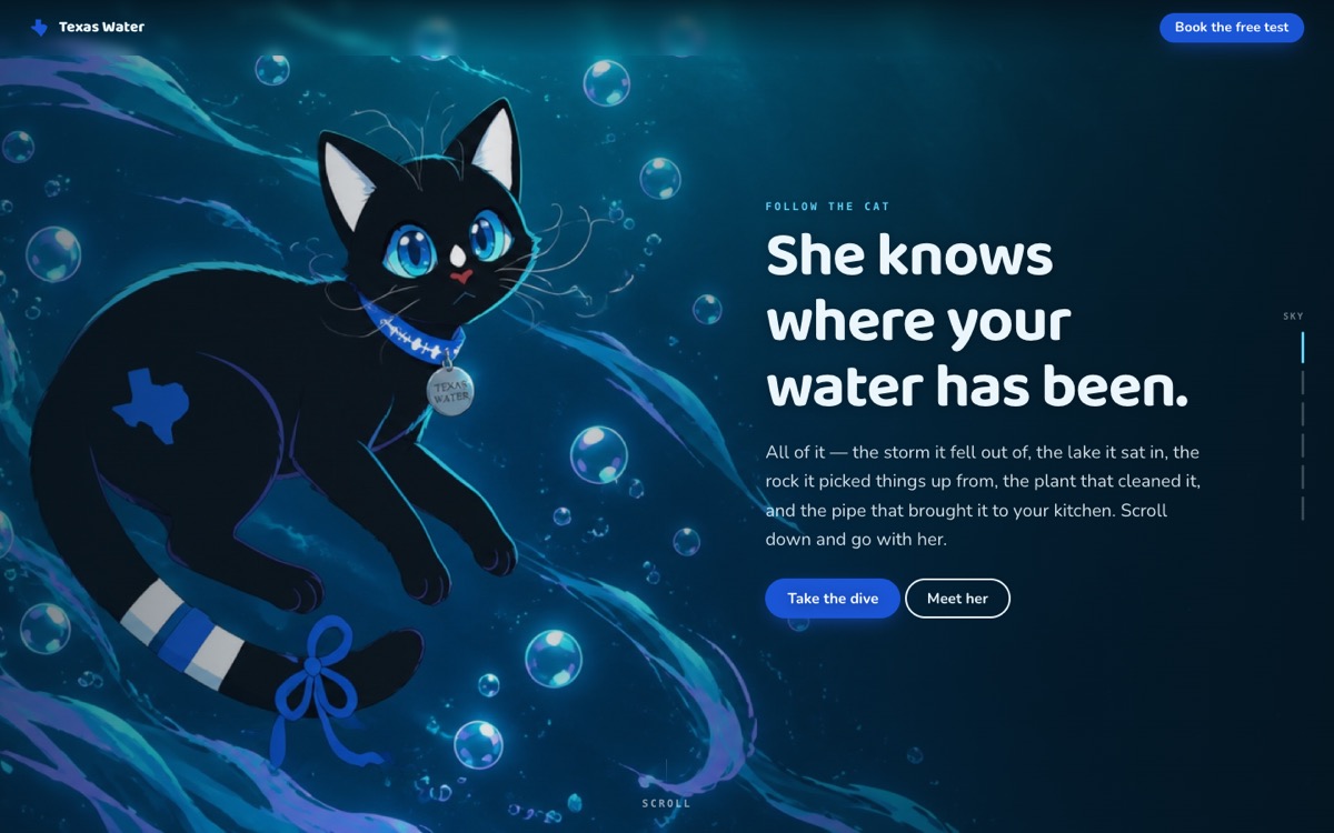
The umbrella one. Scroll and you follow her from the storm the water fell out of, to the lake, to the rock it picked hardness up from, to the plant, to the pipe, to somebody's kitchen tap — the page darkens into an abyss and surfaces into daylight as you go. Every water fact is the utilities' own published material: the reservoirs, calcium and magnesium measured in grains, chloramine, and the annual report every public system has to publish. Nothing is graded or scored. It ends on the free test, because the report describes what left the plant and not what reached your sink. Customer-facing: what you get, how it works, and four straight answers, then the form. The cat is Gazpacho, designed and named by Cassiopeia, age twelve. The design story lives on 92 — the footer credits the illustration and links there.
Gazpacho, the Texas Water cat 8 sites
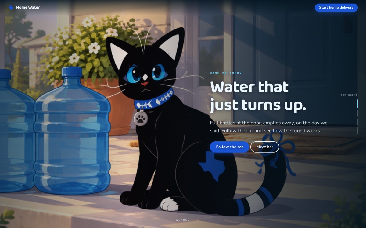
The doorstep round, in four scenes: the delivery, the kitchen, the table, and the empties going back. Same driver, same day, a text the night before; about one five-gallon bottle per person per month as the sizing guide; fulfilment and billing with Texas Water House in Carrollton. Customer-facing: what you get, how it works, and four straight answers, then the form. The cat is Gazpacho, designed and named by Cassiopeia, age twelve. The design story lives on 92 — the footer credits the illustration and links there.
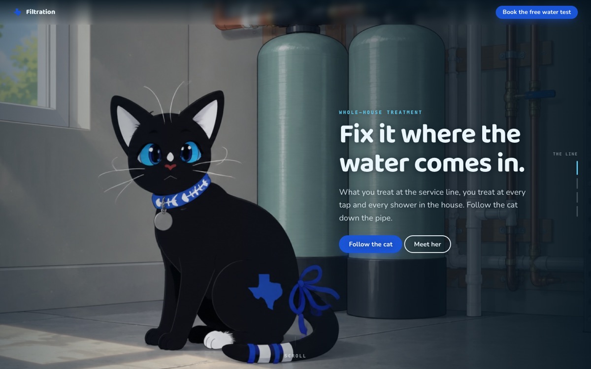
Down the pipe: the service line where everything arrives, the softener trading the hardness out, reverse osmosis under the sink, and the glass at the end. It says plainly that which system a house needs depends on what is in the water, so the free test comes before the quote — and that sometimes the answer is no system at all. Customer-facing: what you get, how it works, and four straight answers, then the form. The cat is Gazpacho, designed and named by Cassiopeia, age twelve. The design story lives on 92 — the footer credits the illustration and links there.
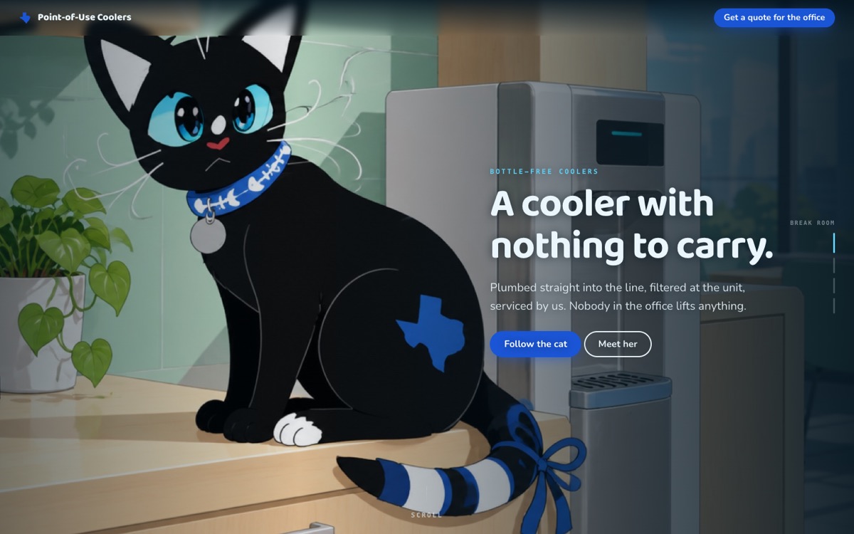
The bottle-free argument made visually: the break room, the storage corner you get back when the bottles go, hot and cold without waiting, and us turning up to change the filters. The empty-corner scene is the one that sells it. Customer-facing: what you get, how it works, and four straight answers, then the form. The cat is Gazpacho, designed and named by Cassiopeia, age twelve. The design story lives on 92 — the footer credits the illustration and links there.
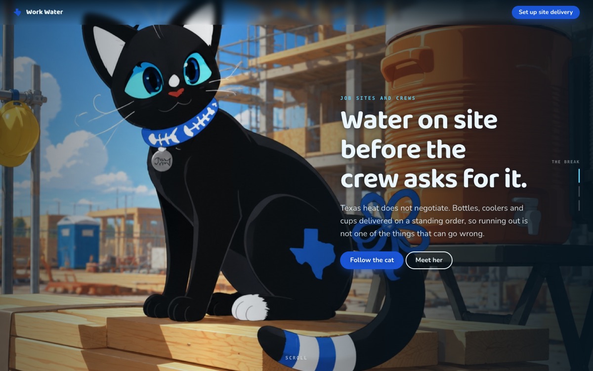
Job sites and crews, in three scenes: the break in the shade, the truck at the gate, and the cooler still full in the site trailer on Monday. Framed around the thing you plan for in Texas rather than react to. Customer-facing: what you get, how it works, and four straight answers, then the form. The cat is Gazpacho, designed and named by Cassiopeia, age twelve. The design story lives on 92 — the footer credits the illustration and links there.
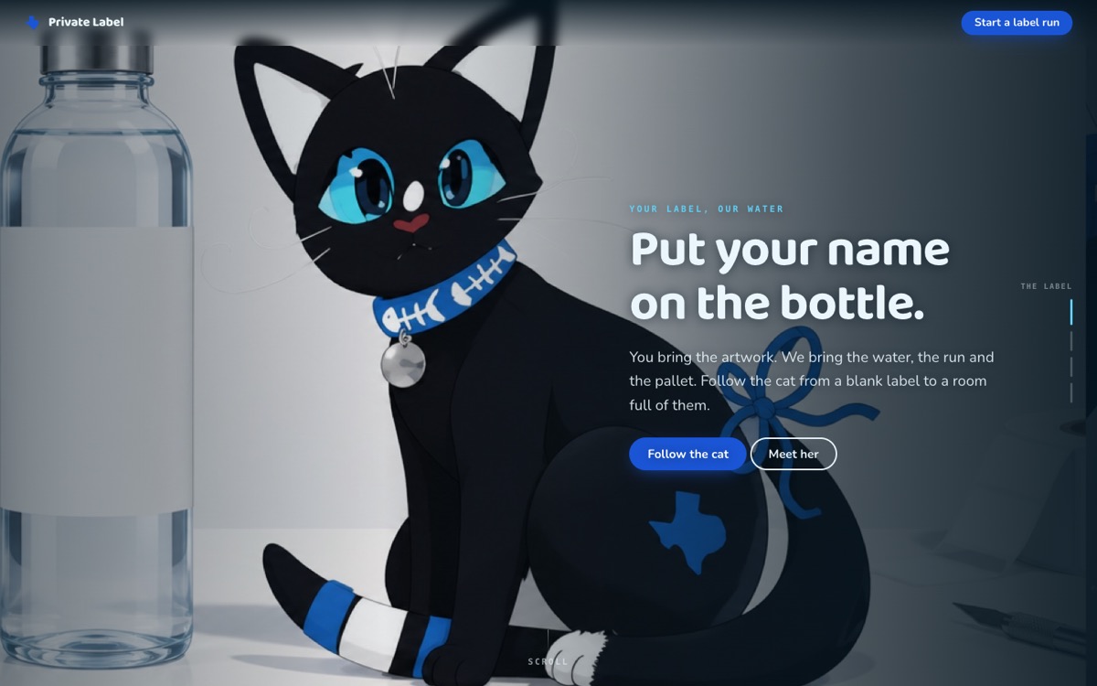
A blank label to a room full of them: your artwork, the pallet, the lobby table, the conference stage. The real numbers from the datasheet are on it — a pallet is seventy cases of twelve, one pallet minimum, three to four weeks, and the clock starts at proof sign-off rather than the deposit. Customer-facing: what you get, how it works, and four straight answers, then the form. The cat is Gazpacho, designed and named by Cassiopeia, age twelve. The design story lives on 92 — the footer credits the illustration and links there.
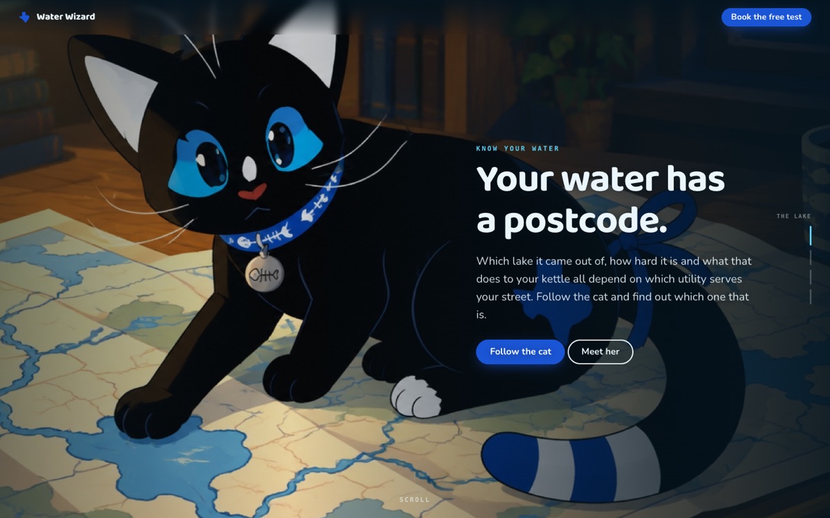
The education one, at a reading age the whole house can manage: which reservoir your street is on, what hardness actually is, the report your utility already published, and the stretch between the plant and your tap that nobody measured. It says out loud that a water system's rating is a real regulated thing the state issues and not ours to invent. Customer-facing: what you get, how it works, and four straight answers, then the form. The cat is Gazpacho, designed and named by Cassiopeia, age twelve. The design story lives on 92 — the footer credits the illustration and links there.
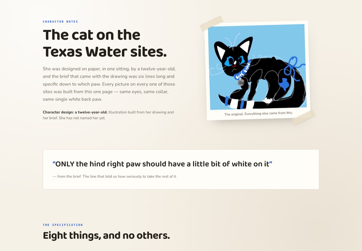
Ours, not a customer page — and deliberately not a Texas Water site: paper instead of deep water, and it sells nothing. Cassiopeia's original drawing taped down at the top, the one line from her brief that set the standard (“ONLY the hind right paw should have a little bit of white on it”), the eight markings written out as a specification with the turnaround sheet beside them, the five colours, a note on how one drawing held across twenty-something pictures, the whole gallery, and the card that says who named her. Every cat site's footer credit links here, which is how the design story got off the customer pages.
Home Water 11 sites
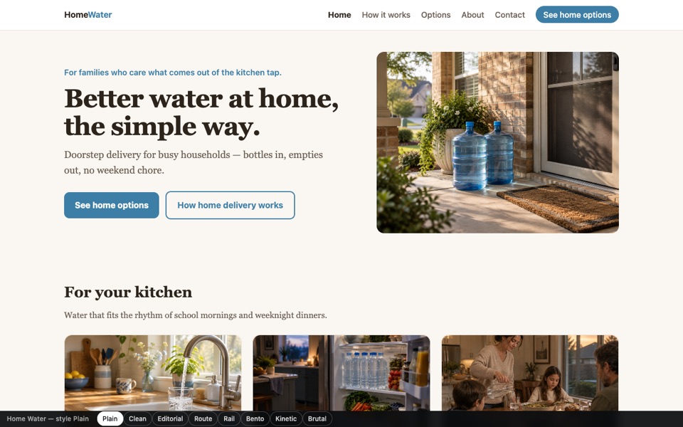
TWH brand site: home water delivery for suburban families, warm neutrals. Pages: home, how it works, plans, about, contact. Contact requests save to the site's leads.
✻ Completed from call data: the qualifying questions he asked for instead of a generic contact box — house or apartment, household size, and an “I am not sure” path. Home Water at customer polish: warm neutrals as its copy describes, eleven photographs, and a quote form that asks house/apartment/office, household size and what you're after — including “I'm not sure”. Tommy's words unchanged.
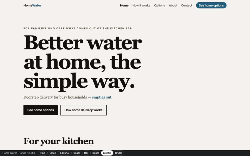
Home Water in the makeover style: one screen at a time, art behind, a few words in front. It walks itself every eight seconds and stops for thirty the moment you touch it; tap right to go on, left to go back.
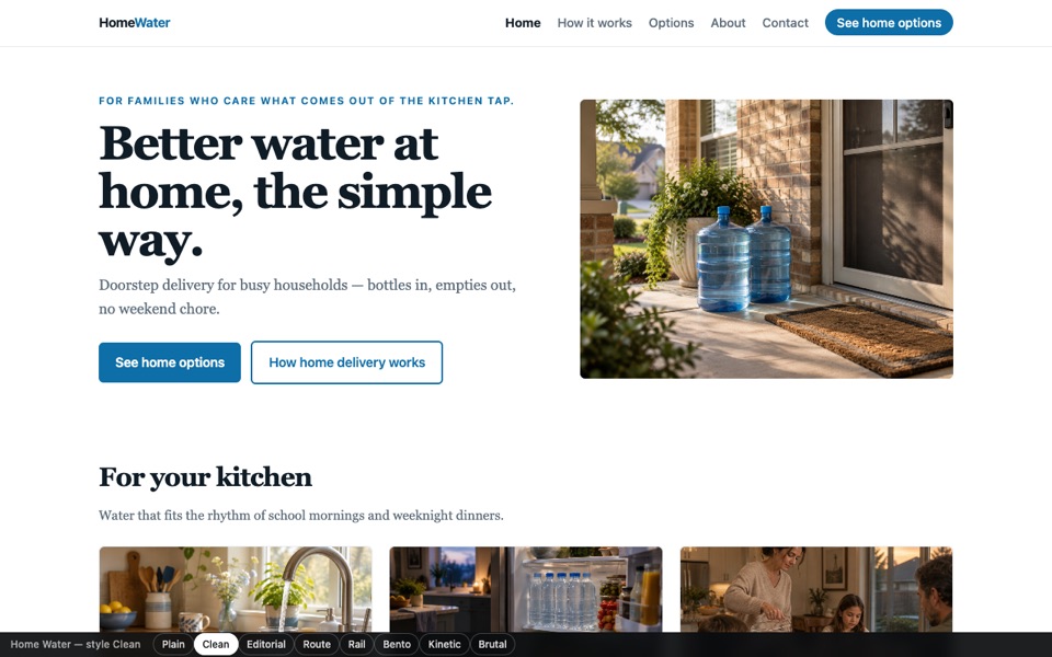
Home Water finished in the clean style — modern direct-to-consumer: white ground, one strong blue, tight grid, big confident type. Same copy, same photography, same qualifying quote form.
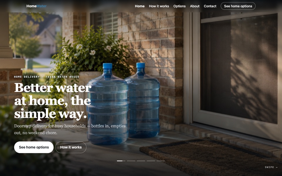
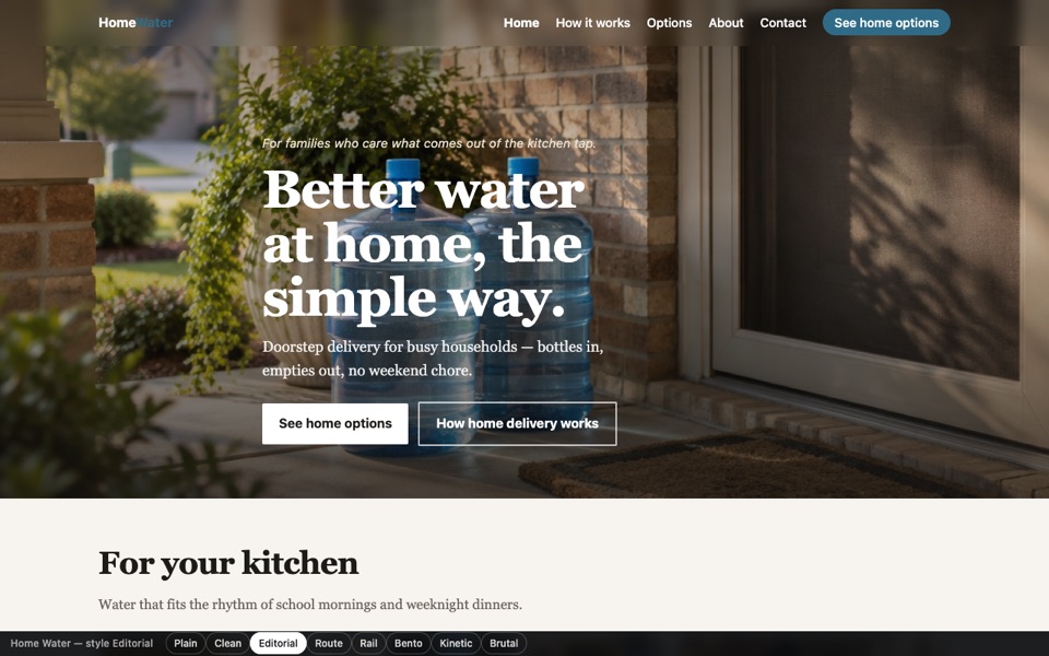
Home Water finished in the editorial style — photography leads: full-bleed hero with the words over the image, deep ink, generous measure. Closest to how a fancier brand (Water Table, Pour Me) would want to look.
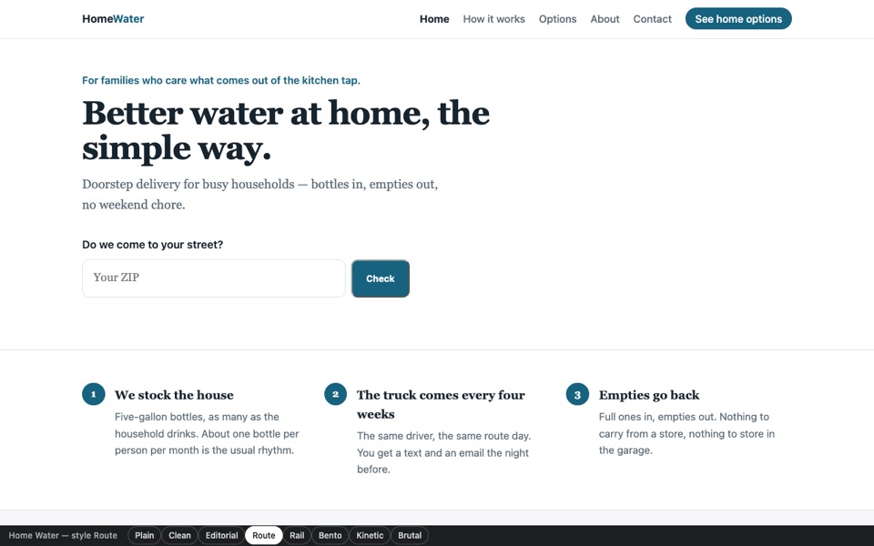
Home Water as a service, not a brochure — the ZIP box is the hero (“do we come to your street?”), then the route rhythm: every four weeks, same driver, empties back. A different page shape, not a different skin.
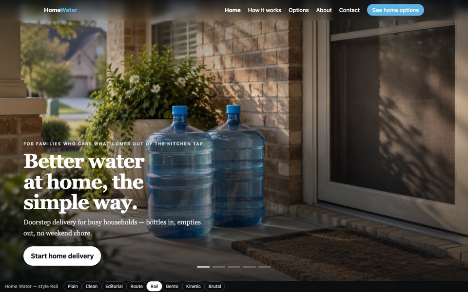
Home Water as one screen at a time, sideways — the story-rail pattern: panels that snap, a dot each, wheel and arrow keys on desktop, swipe on a phone. Mobile-first by construction.
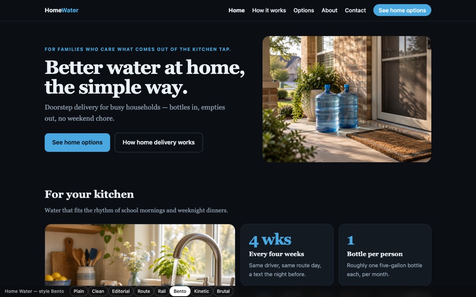
Home Water in the bento style on dark — the 2026 default: one lattice of boxes mixing photographs with the numbers that matter (every 4 weeks, one bottle per person). Researched, not guessed.
Home Water with kinetic typography — type carries the hero instead of a photograph: the headline arrives a word at a time and one line cycles through what the service does. Photography starts below the fold.
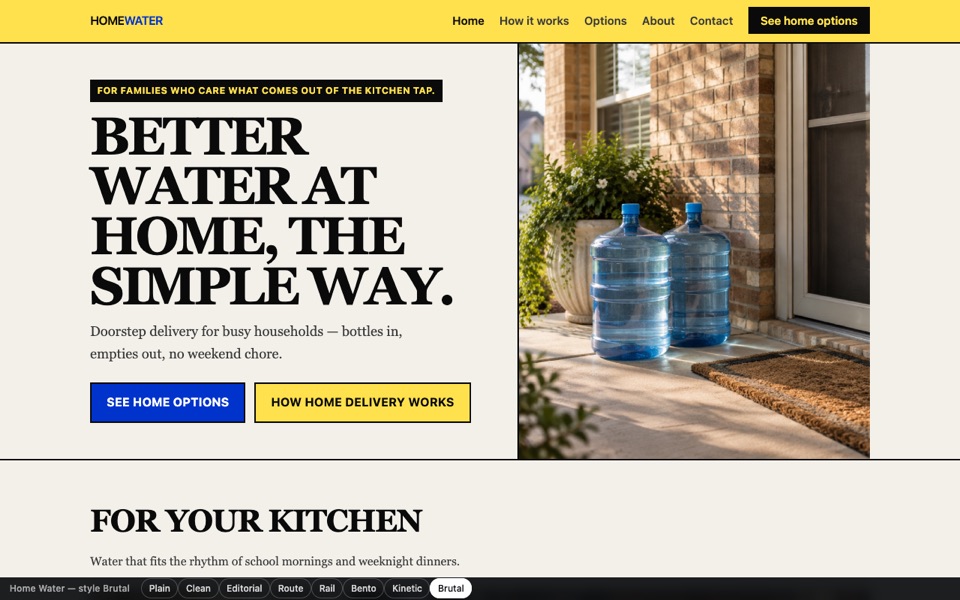
Home Water in tactile brutalism — the counter-move to bento: 0px geometry, hard 2px rules, one loud accent, type doing the shouting. Fast, legible, and it does not look like a template.
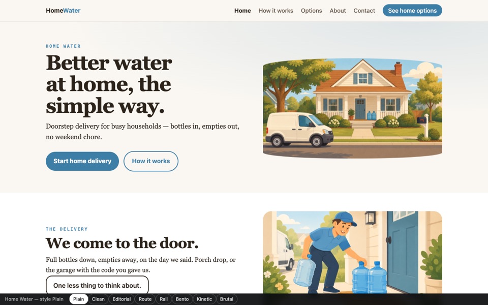
Warm illustration for the one brand whose positioning is being the plain, friendly option: the house, the door, the kitchen, the table. Each scene arrives once as you reach it; nothing loops.
Filtration 5 sites
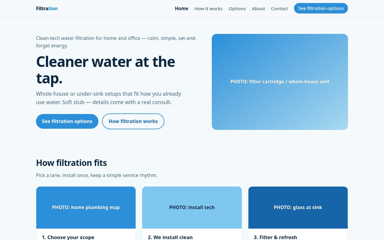
TWH brand site: home and office water filtration. Pages: home, how it works, options, about, contact. Contact requests save to the site's leads.
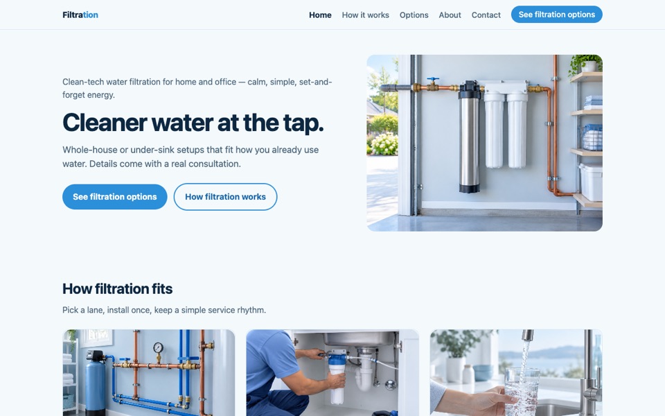
✻ Completed from call data: the per-product quote form he described on 11 Sep, asking what bothers you about the water rather than “how can we help”. Filtration at customer polish in its clean-tech blue and white: whole-house and under-sink photography, a technician at work, and a quote form that asks what bothers you about the water and whether it is city or well.
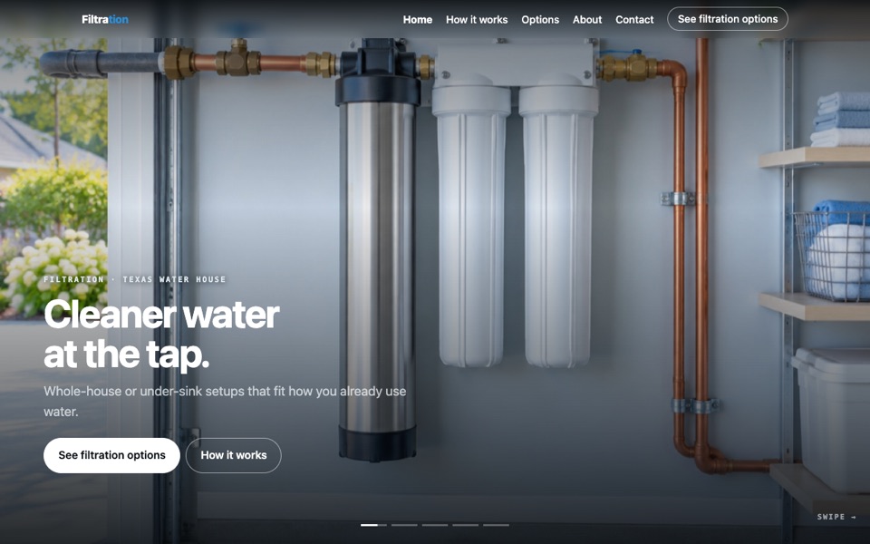
Filtration told as a rail: pick a lane, we install clean, filters on a schedule, water you stop thinking about. Wheel, arrow keys or a swipe move one panel at a time.
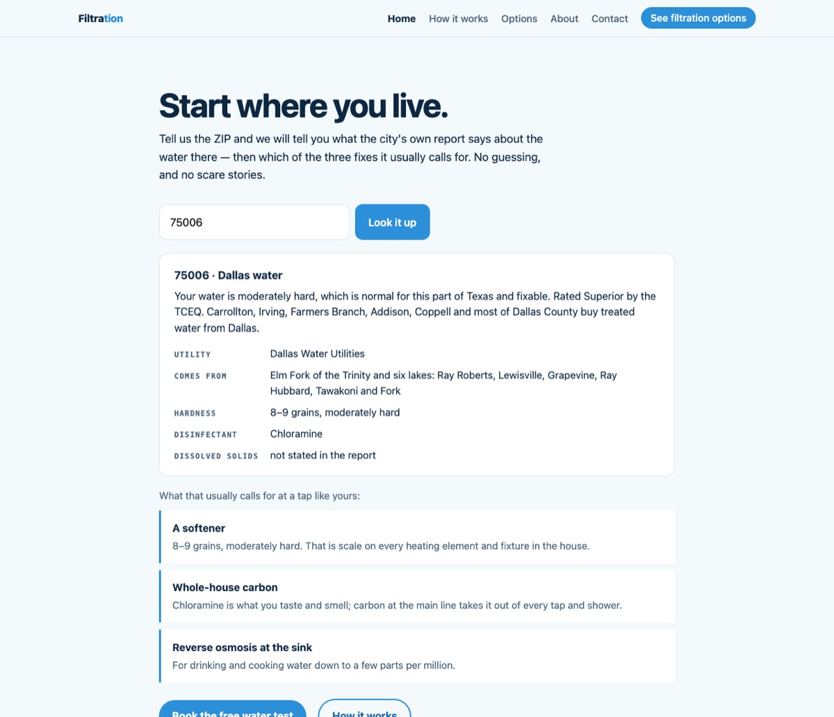
✻ Completed from call data: the funnel shape he described on 11 Sep (“where do you live → here is what your water is → the answer”), plus his rule that the tone softens when the water reads well. The shape Tommy described on the 11 Sep call: where do you live → here is what your water is → here is the answer. Put in a DFW ZIP and it reads that utility's own consumer confidence report — source lakes, hardness, disinfectant — then names which of the three fixes it calls for. Where the report is silent it says so.
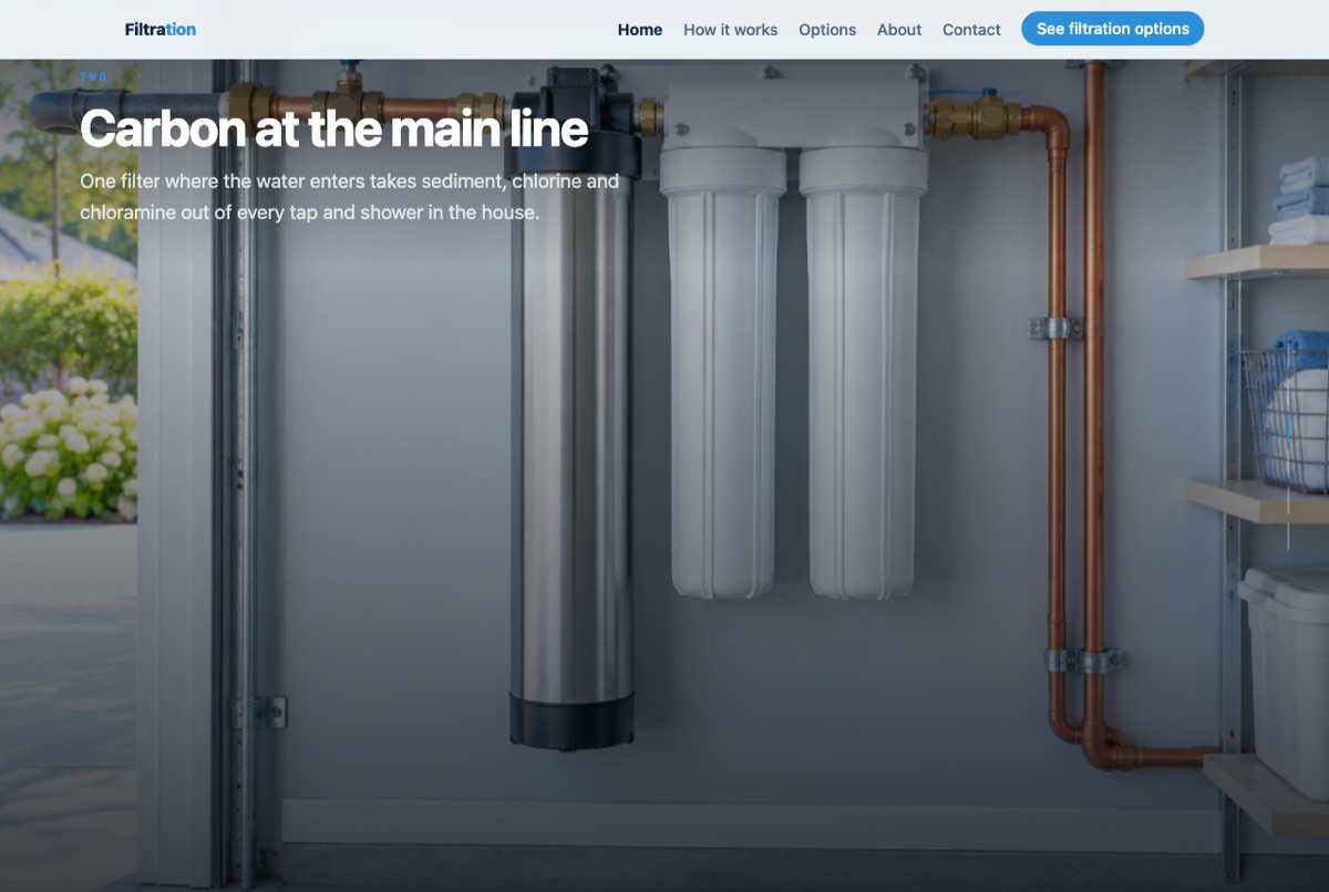
The same scroll-driven treatment turned indoors: the path water takes through a house — the main line, the softener, carbon, reverse osmosis at the sink, and keeping it running. Six scenes.
Point-of-Use Coolers 4 sites
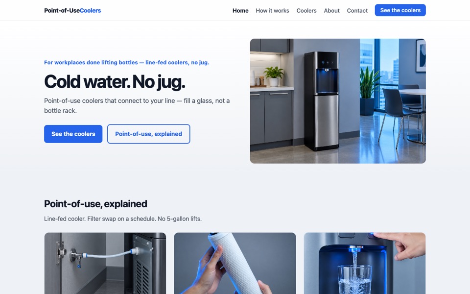
TWH brand site: bottle-less coolers, cool gray and electric blue. Pages: home, how it works, coolers, about, contact. Contact requests save to the site's leads.
✻ Completed from call data: the qualifying form, and the office answer routed to Work Water rather than dropped. Point-of-Use at customer polish in cool grey and electric blue: real bottleless coolers in an office and a kitchen, the line connection, the filter swap. The form asks whether there is a water line near the spot.
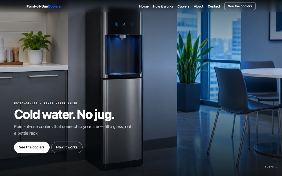
Point-of-use as a rail: plumbed in, filters on a cadence, cold on demand, and where the coolers go. Dark ground, the brand's blue for the one thing to do.
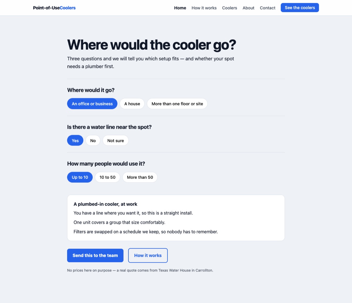
✻ Completed from call data: the “I do not know what I need” path he asked for by name, and the site-visit answer for anyone unsure about the plumbing. Three questions instead of a brochure: where would it go, is there a water line near the spot, how many people. It answers with the setup that fits — and says plainly that if you do not know about the line, that is what the site visit is for.
Private Label 5 sites
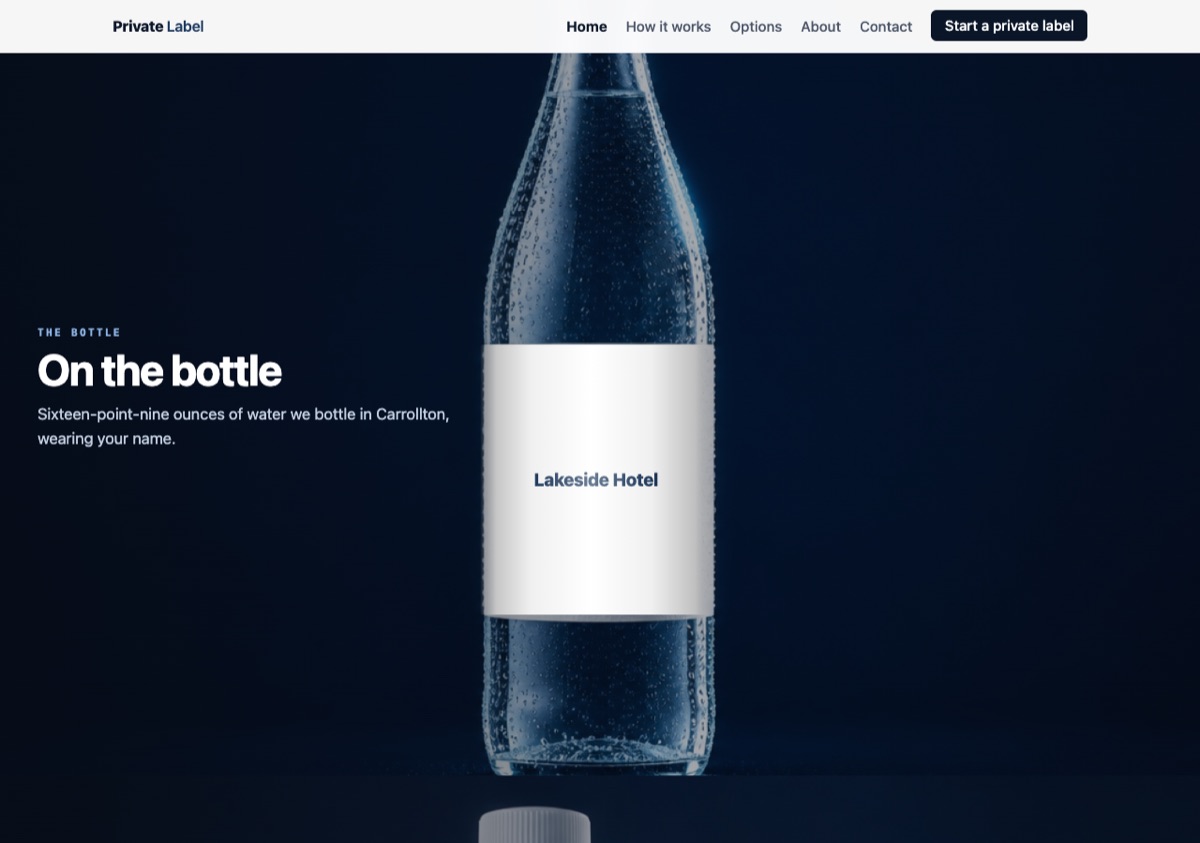
Brand in Hand by Texas Waterhouse: private-label bottled water with your logo on the bottle (1-pallet minimum, logo proof included, nationwide freight). Live at brandinhand.now.
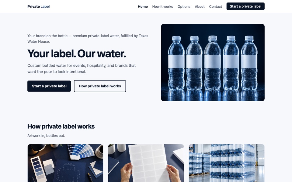
✻ Completed from call data: the artwork-readiness question and the sign-off clock from the datasheet. Private Label at customer polish in premium navy and white: studio bottles with blank labels, artwork, proof sheet, cases on the pallet. The form asks whether artwork is ready and says the clock starts at sign-off, not the deposit.
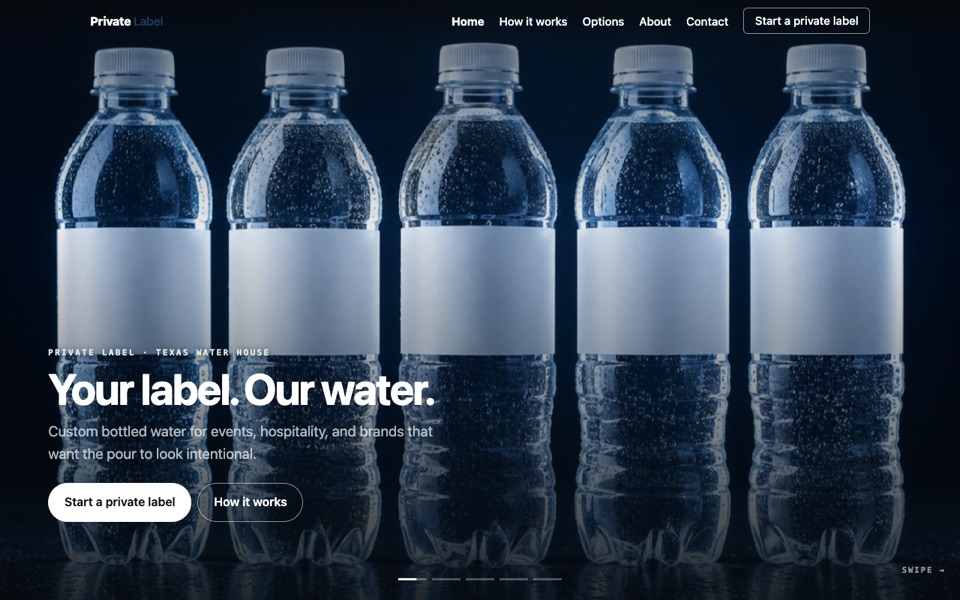
Private label as a rail: your label on our water, share the brand, approve the proof, cases ready. The proof panel says what the datasheet says — sign-off starts the clock, not the deposit.
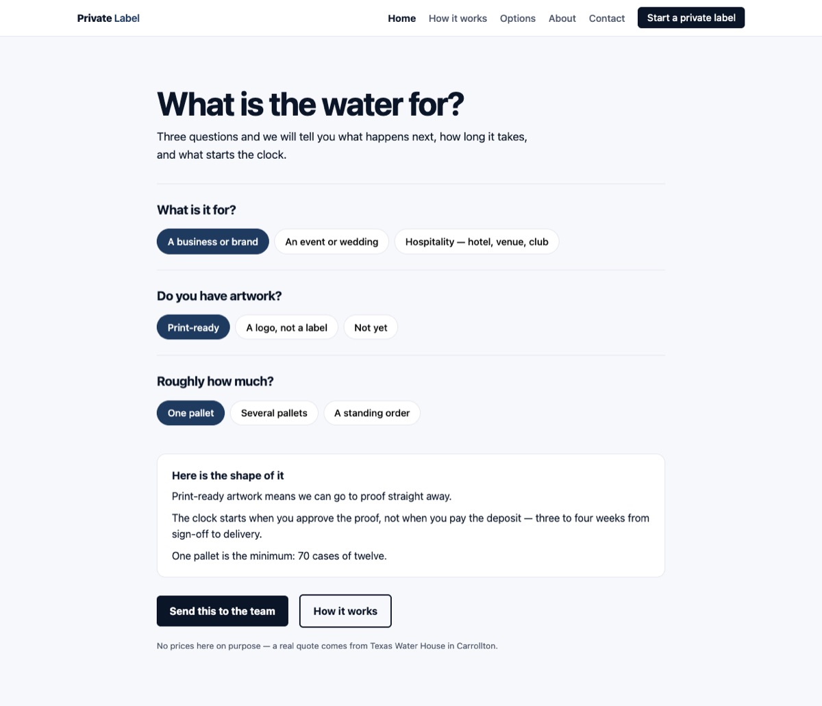
✻ Completed from call data: the artwork bottleneck from the operating datasheet — sign-off starts the clock, not the deposit — and the pallet of 70 cases. Built around the bottleneck the datasheet names: artwork. What is it for, do you have artwork, how much — then it tells you the thing customers get wrong, that the clock starts at proof sign-off, not the deposit, and that a pallet is 70 cases of twelve.
✻ Completed from call data: the Brand in Hand pitch, made literal. Drop a logo in — or pick a demo brand — and it lands on the bottle and on every bottle in the run, then rides through the lobby, the wedding table, the conference stage and the pallet. The artwork never leaves the visitor's machine; it is read in the browser and never uploaded. The facts at the end are the datasheet's: a pallet is 70 cases of twelve, one pallet minimum, three to four weeks, and the clock starts at proof sign-off rather than the deposit.
Water Wizard 9 sites
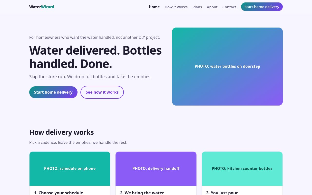
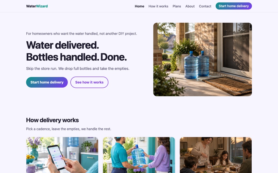
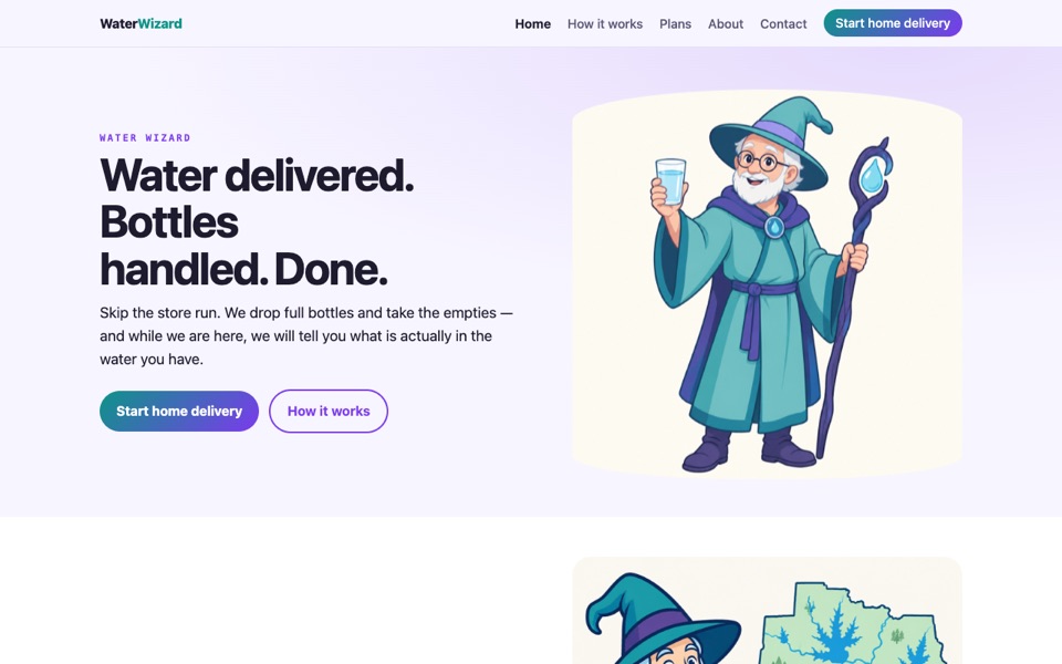
Filed under Home Water: the copy on this one is doorstep bottle delivery, not the education funnel Water Wizard is meant to be. TWH brand site: home delivery under the Water Wizard brand, teal and violet. Pages: home, how it works, plans, about, contact. Contact requests save to the site's leads.
Filed under Home Water: the copy on this one is doorstep bottle delivery, not the education funnel Water Wizard is meant to be. the qualifying form and the one-bottle-per-person-per-month guide from the route facts. Water Wizard at customer polish in teal and violet: the friendlier take on home delivery — bottles on the doorstep, picking a day on the phone, the handoff at the door.
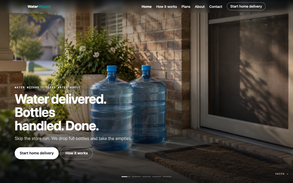
Filed under Home Water: the copy on this one is doorstep bottle delivery, not the education funnel Water Wizard is meant to be. Water Wizard as a rail: choose your schedule, we bring the water, you just pour — and the rhythm, about one bottle per person per month.
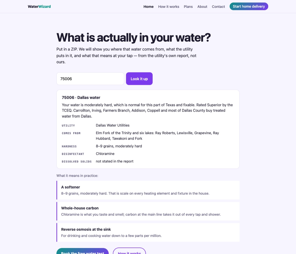
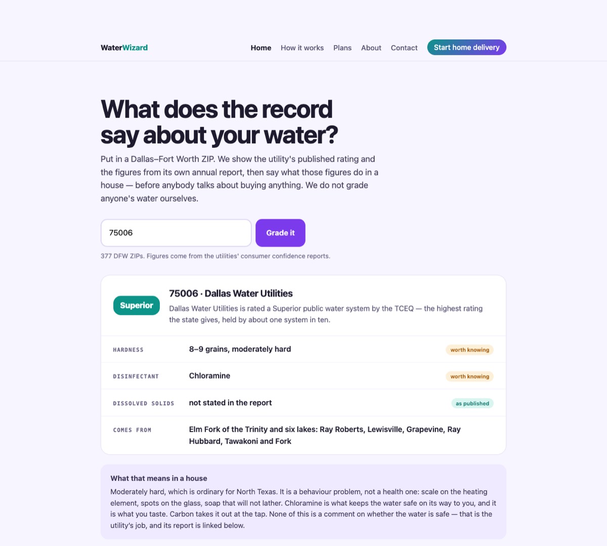
✻ Completed from call data: Water Wizard as the education funnel that routes back to TWH, and the rule that the water-quality material lives here rather than on the TWH site. The education version of the same funnel, which is what Water Wizard is for: a ZIP gets you where the water comes from, what the utility puts in it, and what that means at the tap — then routes back to Texas Water House. Real CCR figures for all 377 DFW ZIPs.
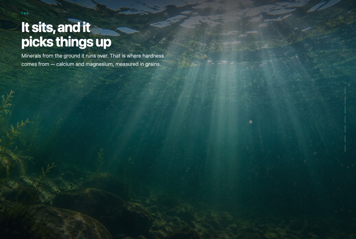
✻ Completed from call data: the education-funnel role the datasheet gives this brand, and the rule that the water-quality story lives here rather than on the TWH site. Scroll-driven: rain over North Texas, the lake, under the surface, the plant, the truck, the kitchen, the glass. Seven scenes, no autoplay, and it degrades to a plain captioned stack under reduced motion.
✻ Completed from call data: the datasheet gives Water Wizard a mascot, so the character is on-brief rather than a novelty. He explains where the water comes from, what hardness actually is, and what arrives — the education job, without the scare tone we are told to avoid.
✻ Completed from call data: the education-first Water Wizard. Type a ZIP and it reads back the real system that serves it — Dallas Water Utilities, North Texas MWD, Trinity River Authority, Denton — the lakes it draws from, the hardness in grains and the disinfectant, from the utilities' own published reports. The TCEQ rating is quoted as the state actually issued it, with the source linked, and where we do not hold a published rating the page says so instead of implying one. Ends on the free test at your own tap, because the utility's report describes what left the plant and not what arrives at your kitchen.
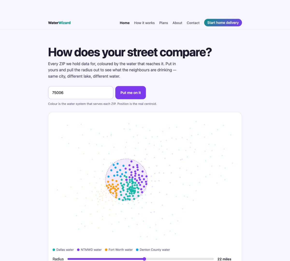
✻ Completed from call data: the same education, drawn instead of typed. A map of Dallas–Fort Worth with 377 ZIPs plotted by which utility serves them, so a visitor can see that the boundary is a water boundary and not a city one. Click a district and it opens what that system is, where it draws from and what that means for a house on it — published figures only, sources on the card.
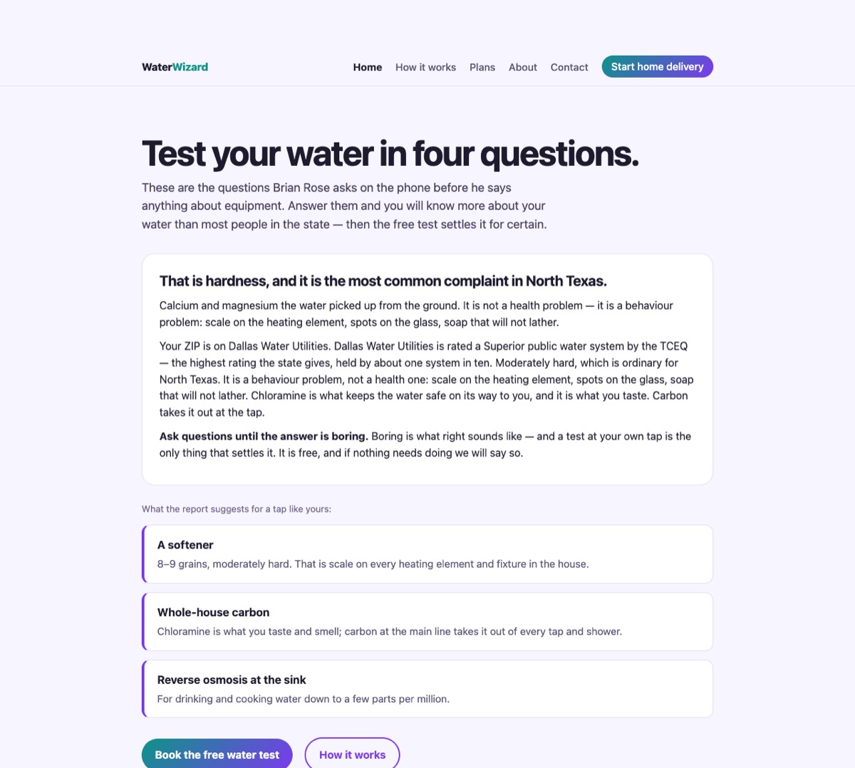
✻ Completed from call data: five questions about what you actually notice — spots on the glass, a smell at the tap, dry skin, scale on the kettle — and it names what each symptom is, in plain language, against the real figures for the system your ZIP is on. Product comes last and only where the symptom calls for it: softener, carbon, reverse osmosis or nothing at all. Then the free test, which is the only thing that measures your own tap.
Work Water 4 sites
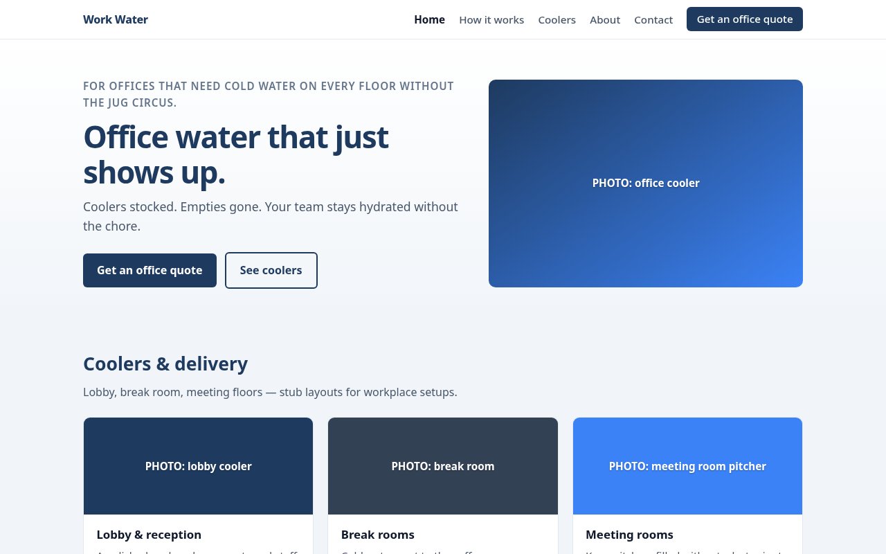
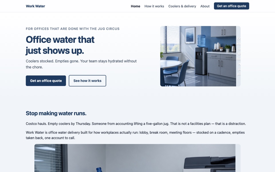
TWH brand site: office water delivery, corporate blue and gray. Pages: home, how it works, coolers, about, contact. Contact requests save to the site's leads.
✻ Completed from call data: the qualifying form sized to floors and headcount. Work Water at customer polish in corporate blue and grey. It had written art direction instead of placeholders, so every shot was made to its own captions — the empties pile, the lobby cooler, the break room, the dock at first light.
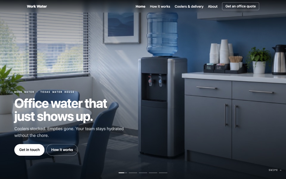
Work Water as a rail: office water that just shows up, the empties chore, the lobby, the break room, and the dock at first light.
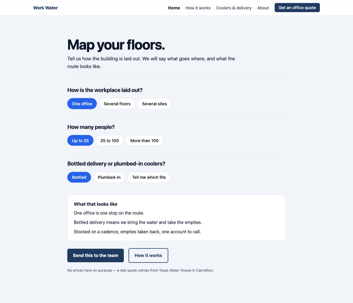
✻ Completed from call data: “Map your floors”, his own phrase, and the mixed bottled/plumbed answer most workplaces land on. “Map your floors”, which is Work Water's own phrase, made into the page: how the workplace is laid out, how many people, bottled or plumbed — and it says what most workplaces actually end up with, which is a mix.
Texas Water House, the rest 1 site
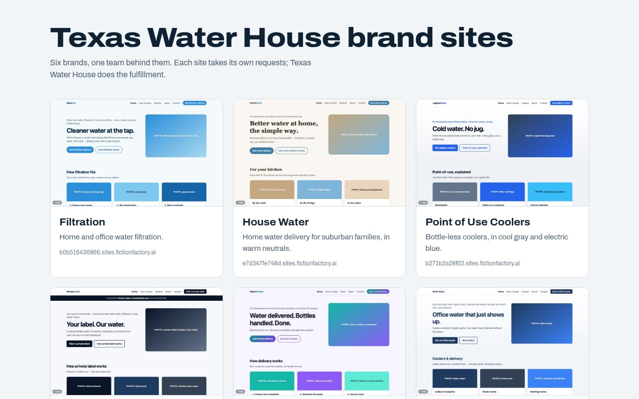
Index of the six TWH brand sites, each with its thumbnail and link.